Thursday, May 13, 2010

Competitor's website


url: http://www.gunthers.com.sg/menu.html


Analysis:
1) This website make me felt like a high class restaurant.
2) Compare to the client's is definitely clearly than the client's one.
3) But...the size of the typefont is a bit small...
4) The mood is quite nice for me...

Competitor's website:

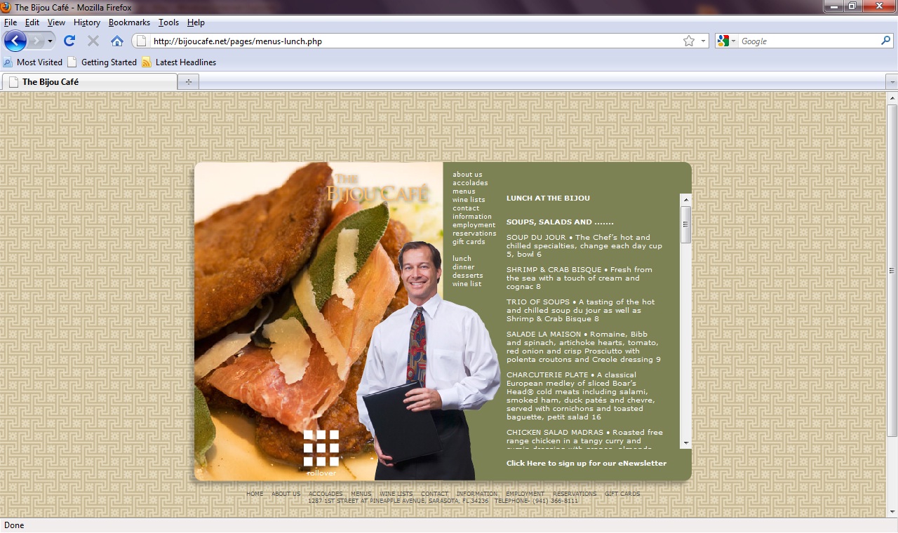
url: http://bijoucafe.net/index.html


Analysis:
1) This kind of layout is quite simple and nice...they got some rollover effect to change the pic for the page
2) But I do not know which status that i stay...
3) The info/content quite clear...easy to get the info as well.
4) Just a part one of the page(contact) it's make me felt empty...maybe is without the photo...
5) This website is clear than the client's website...althought it's easy to read...

Client's website

My analysis for this client's website is:
1)For the homepage, unless for the background is flat, the visual & layout it's terrible(for me)                        
2)Look very messy...too much of different photo....                                                                                      
3)the navigatoin bar it's like just put on it, nothing much...(boring)                                                                   4)the composition of menu page it's messy too...(maybe of the background image)                                        
5)for the about us page...the content is too long...will let me feel boring to read on...                                      
6)the requires of the feedback is quite clear                                                                                                  
7)for the locate page, it's really hard to see and some of the content part was out of position.                         

Gantt Chart

Tuesday, March 30, 2010

This is my "Web Design" for Design Mwthod 2

Fisrt of all, I would like to do a user testing for my website...which is kopitiam website
Anyone can give any comment or suggestion or anything else about on it...color mood, functional, feeling, contrast, rollover effect is it ok? or anything also can let me know(write on english or chinese also can^^)
But I want to tell u all first I haven't complete all of it yet...so just looking for the others that I was completed first^^
(And I wouldn't explain that what is what about that first...Coz I would like to know how is ur first time to see my website...so that I can make it better than this time)
I will keep loading on it^^
the others will coming soon (^^,)

Monday, January 18, 2010